
This add-on is part of our Subscription plan.
Subscribe once — enjoy all add-ons without limits.
Disabling blocks for mobile devices
What it is for
The add-on helps control which storefront elements are rendered for phones, tablets, and desktop computers. It lets you remove heavy banners, sliders, or secondary content from selected device types without maintaining a separate layout for each storefront version.
Key features
- Disable individual layout blocks for phones, tablets, or desktop computers.
- Disable entire layout grids by device type.
- Apply device restrictions to product tabs that use block settings.
- Detect the visitor's device type automatically when the storefront opens.
- Use mobile, tablet, and desktop flags in storefront templates.
- Record the order source and show the device in the orders list, including orders created through an app.
How it works
An administrator selects the device types for which a block or grid must not be rendered. When the page opens, the add-on detects the current device and excludes the matching elements before the final page markup is produced.
When an order is placed, the add-on records its source as phone, tablet, desktop, or app. The value is displayed in a separate column in the orders list and helps identify which devices customers use to place orders.
Still have questions about this add-on?
- Store Builder
- Store Builder Ultimate
- Multi-Vendor
- Multi-Vendor Plus
- Multi-Vendor Ultimate
- Owners
- English
- Русский
- 4.21.X
- 4.20
- 4.19.X
- 4.18.X
- 4.17.X
- 4.16.X
- 4.15.X
- 4.14.X
- 4.13.X
- 4.12.X
Instructions for the “Disabling blocks for mobile devices” add-on
What the add-on does
The add-on excludes selected blocks, product tabs, and layout grids from the storefront output on phones, tablets, or desktop computers. It also records the order source and adds a “Device” column to the orders list.
Where to find the add-on
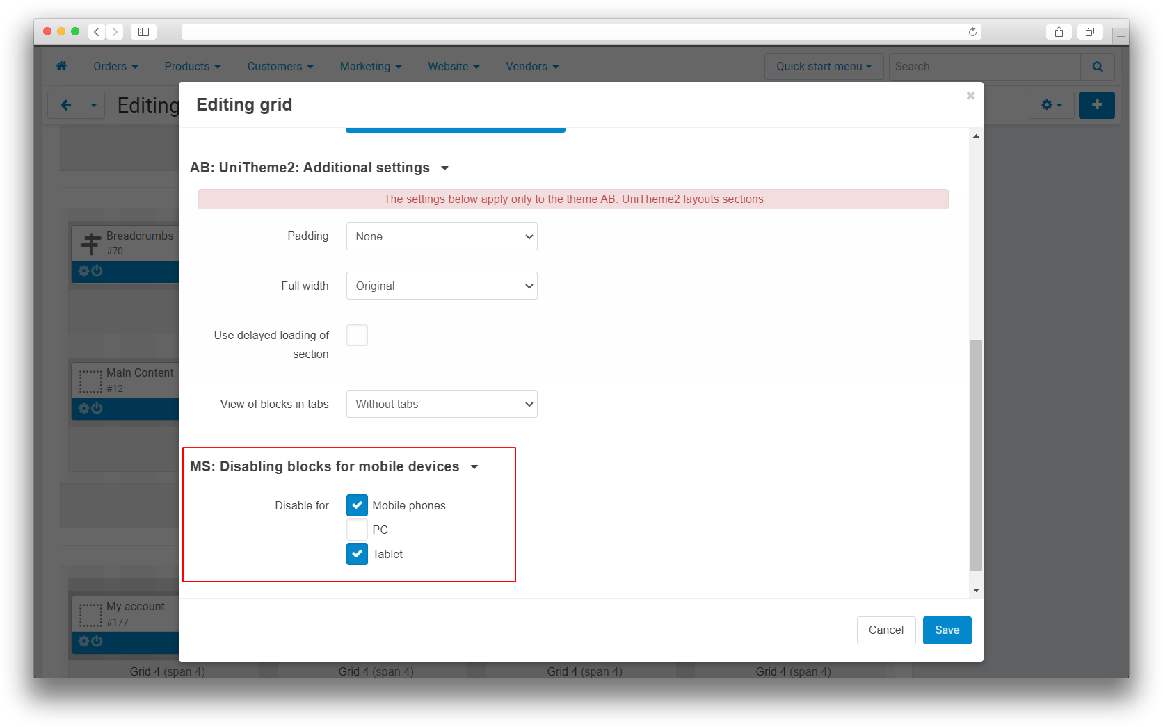
- Design → Layouts — block and grid settings with the “Disable for” group.
- Add-ons → Manage add-ons → Disabling blocks for mobile devices — general add-on settings.
- Orders → View orders — the “Device” column with the order source.
How to disable a block for selected devices
- Open Design → Layouts and select the required layout.
- Open the block settings.
- In the “Disable for” group, select phone, tablet, or desktop. You can select more than one option.
- Save the changes.
How to disable a layout grid
- Open the required grid settings in the layout editor.
- Select the device types for which the grid must not be rendered.
- Save the grid and clear the storefront cache.
Order source
When an order is created, the add-on records one of these sources: phone, tablet, desktop, or app. The value appears in the “Device” column on the orders list page. Orders created before source recording started may have an empty value.
The add-on settings contain a “Show order source” switch. In the current implementation, the orders list templates do not check this switch, so the column is rendered regardless of its value.
Device flags in templates
The add-on stores the isMobile, isTablet, and isDesktop flags in settings available to storefront templates. They can be used in custom markup that depends on the current device type.
How to verify the result
- Disable a test block for phones and save the settings.
- Clear the CS-Cart cache.
- Open the page on a desktop and make sure the block is displayed.
- Open the same page on a phone or in mobile device emulation mode and make sure the block is absent.
- Repeat the check for tablets and desktops if separate restrictions are configured for them.
- Place a test order from the required device and check the value in the “Device” column.
If a restriction is not applied
- Make sure the block or grid changes were saved.
- Clear the CS-Cart cache after changing the device restrictions.
- Check the result on a physical device because browser emulation may not fully reproduce mobile client headers.
- Make sure you are checking the layout and storefront where the restriction was configured.
Changelog
v1.3.2 28.09.2026
[*] Updated the license verification mechanism.
[+] Added the description, instruction, and changelog to the add-on page in the administration panel.
[*] Moved service column installation to migrations that check whether the required tables and fields exist.
[*] Updated event handler organization and administration panel styles to the current add-on structure.
[!] Fixed.
[*] Eliminated PHP 8.2 warnings when processing an empty User-Agent.
[*] Device detection now reuses one detector instance while processing product tabs and layout grids.
v1.3.1 from 2026-01-21
[!] Fixed.
[*] Eliminated the PHP Deprecated warning caused by passing an empty value to preg_match() ; improved compatibility with PHP 8.1 and later.
v1.3.0 from 2026-01-19
[+] Added.
[+] Added order source detection and storage.
v1.2.1 from 2023-12-28
[!] Fixed.
[*] Disabled caching for the device detection variable.
v1.2.0 from 2023-12-20
[+] Added.
[+] Added device detection variables for templates.
v1.1.6 from 2023-08-11
[+] Standardized the add-on structure.
[*] Corrected language variables and interface element alignment.
[*] Replaced short PHP tags with full tags.
v1.1.5 from 2023-06-13
[!] Fixed.
[*] Blocks with device restrictions no longer become hidden in the administration panel.
v1.1.4 from 2023-06-09
[!] Fixed.
[*] Blocks with identical identifiers are displayed correctly in layouts.
v1.1.3 from 2023-06-09
[!] Fixed.
[*] Corrected the existing database column check.
v1.1.2 from 2023-06-09
[!] Fixed.
[*] Resolved errors that occurred while adding columns during installation.
[*] Resolved notices shown when values were missing on certain pages.
v1.1.1 from 2023-05-15
[*] Updated the licensing mechanism.
Legend:
[+] Added
[-] Removed
[*] Changed
[!] Bug fixed
Here you can share your opinion and evaluate our work.
Your feedback helps us become better and offer you even better service.