
Save 45%

This add-on is part of our Subscription plan.
Subscribe once — enjoy all add-ons without limits.
Disabling blocks for mobile devices
What it is for
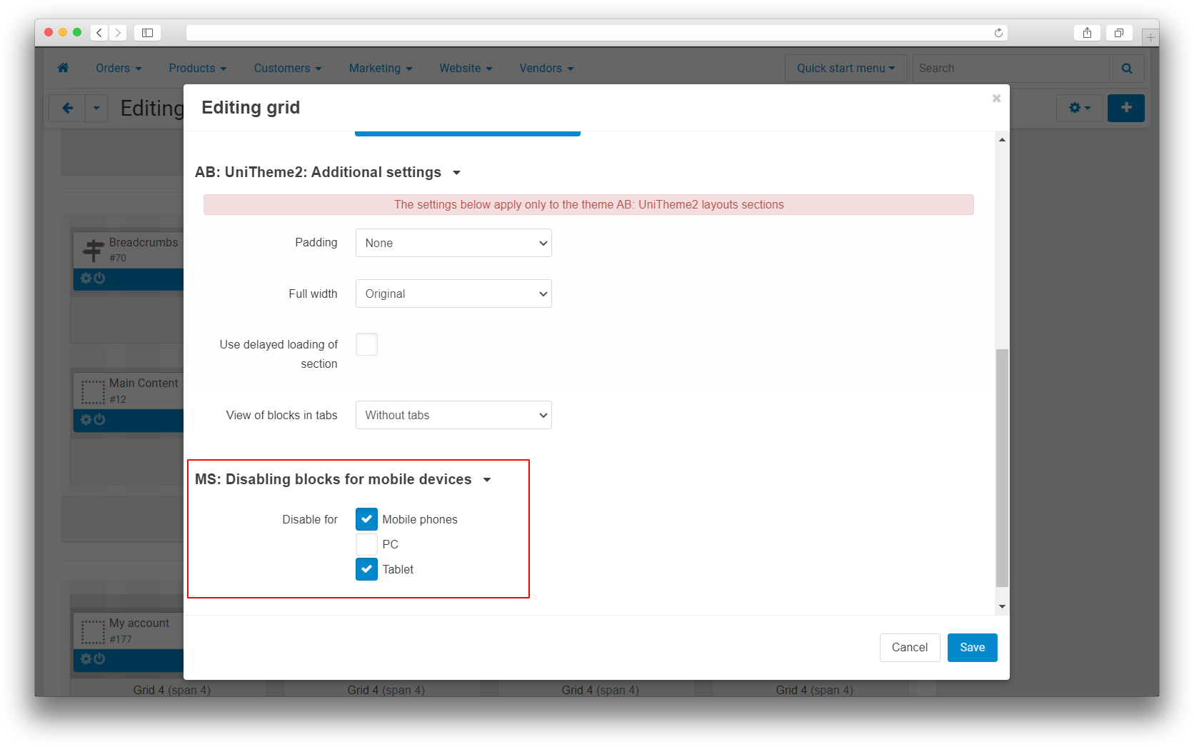
The add-on helps control which storefront elements are rendered for phones, tablets, and desktop computers. It lets you remove heavy banners, sliders, or secondary content from selected device types without maintaining a separate layout for each storefront version.
Key features
- Disable individual layout blocks for phones, tablets, or desktop computers.
- Disable entire layout grids by device type.
- Apply device restrictions to product tabs that use block settings.
- Detect the visitor's device type automatically when the storefront opens.
- Use mobile, tablet, and desktop flags in storefront templates.
- Record the order source and show the device in the orders list, including orders created through an app.
How it works
An administrator selects the device types for which a block or grid must not be rendered. When the page opens, the add-on detects the current device and excludes the matching elements before the final page markup is produced.
When an order is placed, the add-on records its source as phone, tablet, desktop, or app. The value is displayed in a separate column in the orders list and helps identify which devices customers use to place orders.
Still have questions about this add-on?